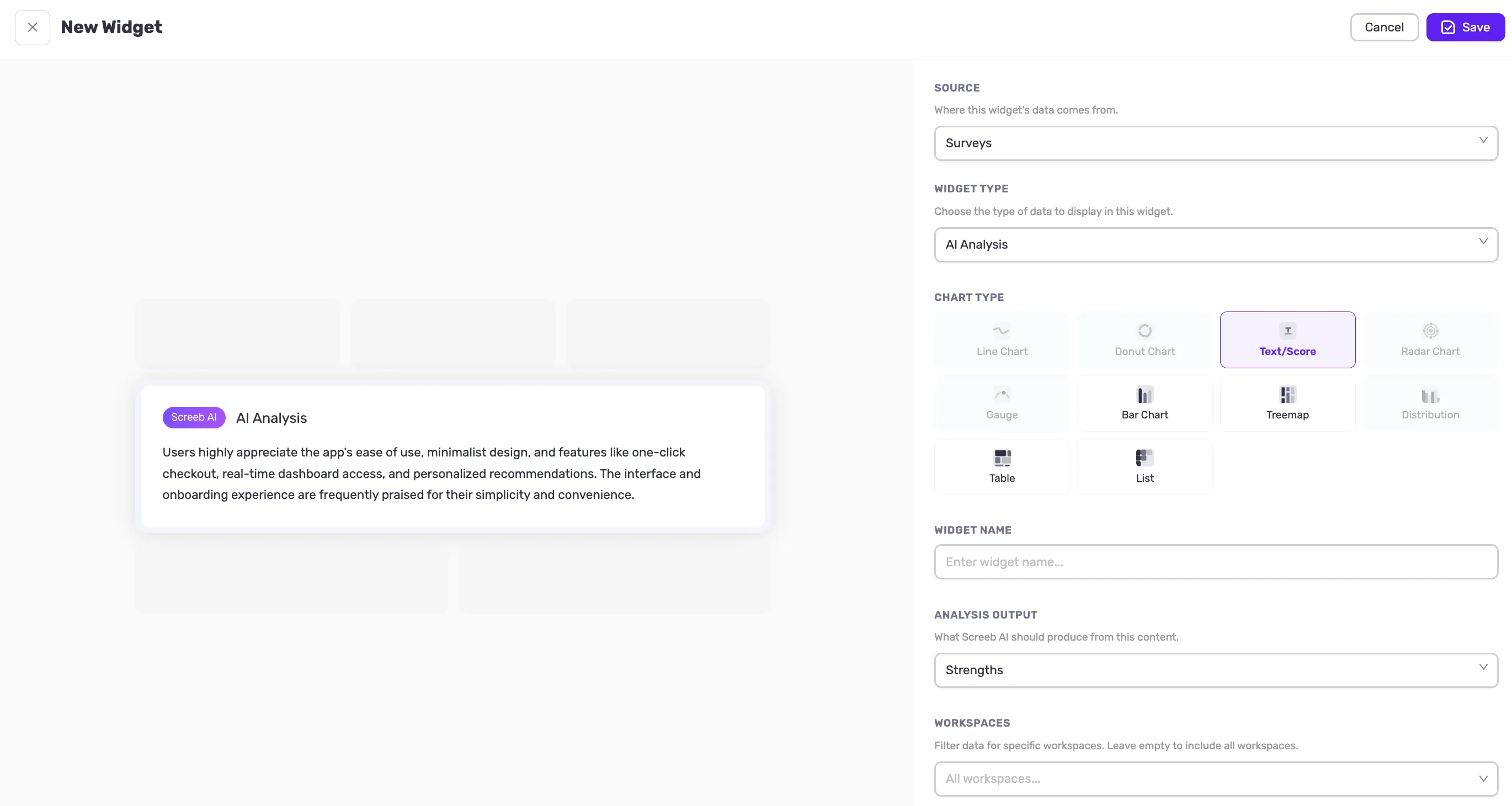
Two weeks into September, and we’re keeping the promise we made at the start: a new theme every week, pulled from everything we’ve shipped these past months. After Heatmaps and AI, it’s dashboards’ turn this week — handing you more control over the other side of Screeb: your data, your view, your rules.
A generic dashboard only gets you so far. This week’s updates are about building the exact view your team needs — your metrics, your data sources, your comparisons — with AI doing the synthesis when you’d rather not dig.
Usage Data in Dashboards
📊 Your Usage Data Now Lives in Screeb Dashboards Too
Dashboard widgets can now be built on events and pageviews, not just survey responses. Track feature adoption, funnel steps, traffic on key pages — the quantitative usage metrics you’d normally go to a separate analytics tool for.
And because survey responses live in the same place, a single dashboard can now hold both: what people do in your product, and what they tell you about it. Same view, side by side, no tool switching.
Benefits:
- Answer “is this feature actually being used?” without leaving Screeb
- Explain a drop in usage with the feedback that goes with it — in one place
- Share a single view with your team instead of stitching two tools together
- Spot the gaps early: features people use but dislike, or love but never find
Segment & Variant Comparison Widget
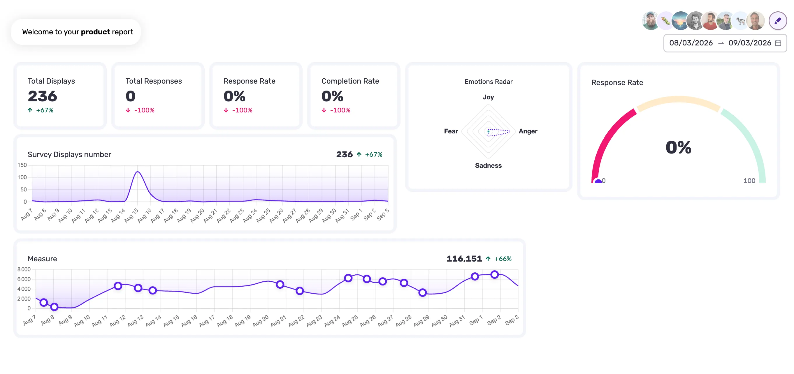
🧪 Compare Segments and Variants Side by Side in One Widget
A single widget can now display the same metric broken down by group: user segments, experiment variants, control vs. treatment. Whether it’s a quantitative usage metric or a qualitative survey result, you compare populations on the same indicator, in the same chart.
That makes A/B test and experimentation results readable directly in your dashboards — up to 4 variants against a control group, next to the rest of your KPIs.
Benefits:
- Know which variant actually won, instead of guessing from a “feels better”
- See if a change helped one segment and hurt another, before you roll it out
- Read experiment results next to your other KPIs, not in a separate tool
- Compare any population you care about — plan, persona, cohort — not just A/B groups
Custom Formulas
🎛️ Build Your Own Formulas on Screeb Data
On top of Screeb’s built-in metrics, you can now write your own formulas on the data you collect. Combine, weight, average, divide — whatever your calculation actually is.
Weight survey results so a segment counts more than another. Average a score across several surveys instead of reading them one by one. Add up sub-scores into a single composite index. Divide an event count by your active user base to get a real adoption rate. Then display the result as a percentage, a currency or a duration, in a text card or a gauge.
Benefits:
- Get the number your business actually runs on, not the closest available approximation
- Stop exporting to a spreadsheet every time you need a calculation Screeb didn’t ship
- Keep everyone reading the same definition of a metric, instead of five versions in five decks
- Turn scattered survey and usage data into one figure you can put in front of your leadership
AI Analysis Widget for Dashboards
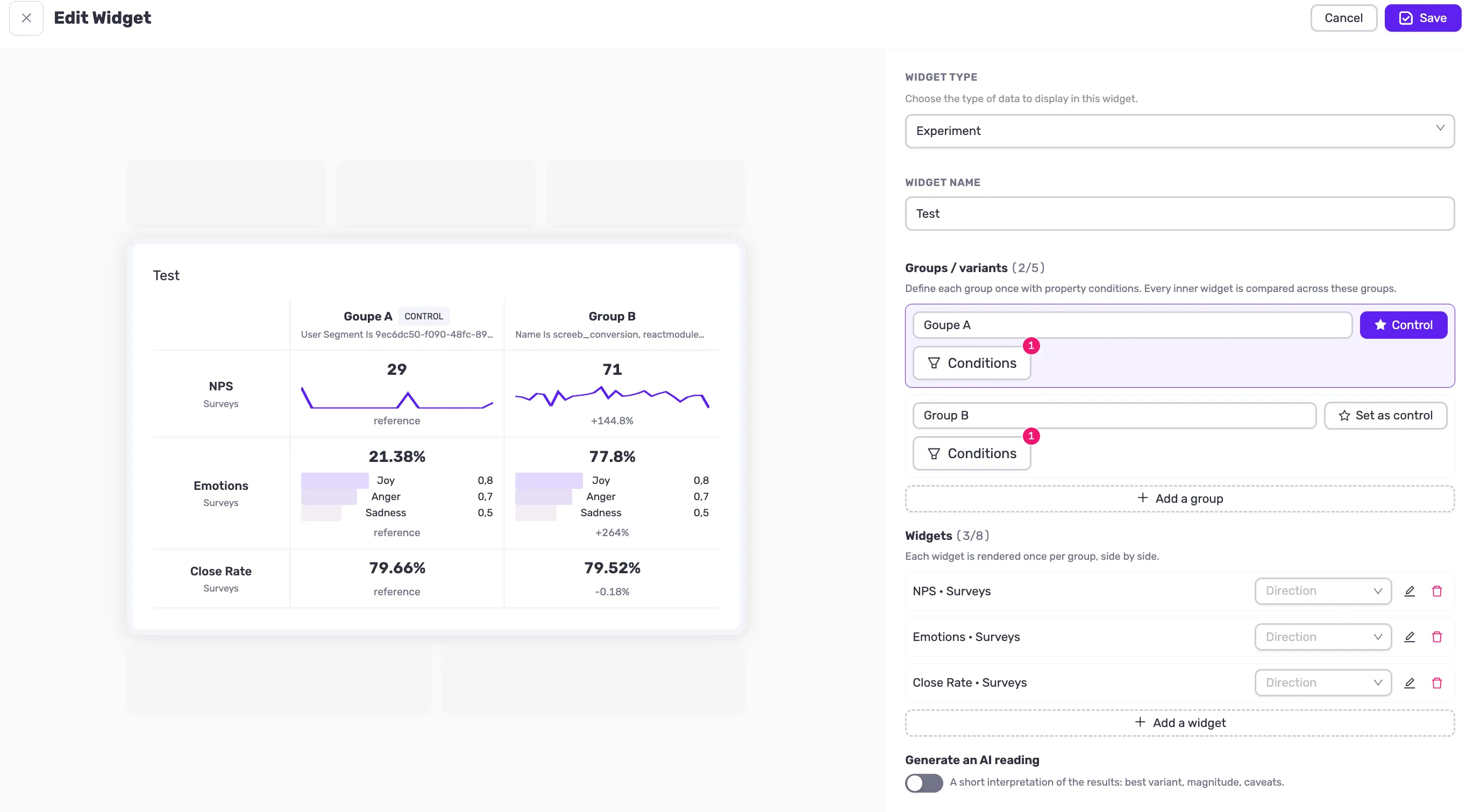
🧠 Your Own AI Analysis, Running on Your Dashboard
A new AI widget analyzes your open-text data directly on your dashboard — survey responses, but also event properties. For instance, if you track a form submission and pass its content as an event property, that text can be analyzed too.
Start from Screeb’s preset prompts or write your own. Your custom prompt is saved in the widget and keeps running: every new response or event collected afterwards goes through the same analysis, automatically.
Benefits:
- Ask your own question of your data, instead of picking from a fixed list of analysis
- Set up the analysis once and let it run on everything that comes in next
- Get an answer that’s already written for your audience, not a chart to interpret
- Put text feedback and form content to work, instead of leaving it unread